How to design a booking route that not only works, but convinces.
A strong website is standard today. But the decisive moment comes later – when booking. This is where it is decided whether the website visit turns into a real stay. The booking screen is not just technology. It is part of your brand image. It is often the first real point of contact with the guest.
OnePageBooking brings all the steps onto one page – clearly structured, visually appealing and entirely in the look of your hotel. But how do you get the best out of your booking process?
Here are five design tips to help you turn prospective customers into direct bookers – intuitive, simple, brand-appropriate.
1. first impressions count – also digitally
In the upscale hotel industry, the first contact is more than just a click – it’s a statement. The booking screen should not look like a form, but like a conversation with the concierge: clear, personal and stylish.
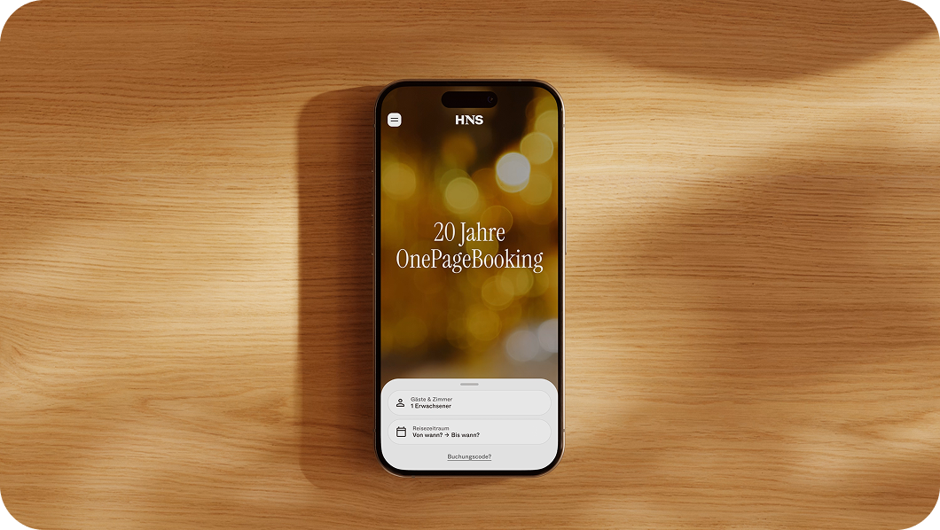
OnePageBooking guides your guests to their destination on one page – intuitively, visually strong, in the style of your hotel. Colors, font sizes, buttons – everything adapts to your corporate design.
Our tip
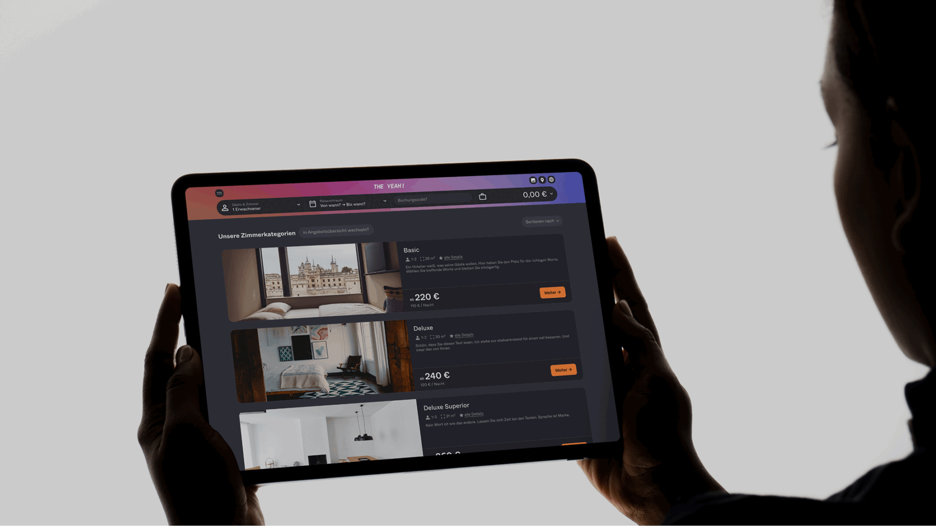
Take advantage of the creative freedom. Expressive images in the gallery, attractive package visuals and stylish contrasts make your booking route unmistakable – functional and aesthetic at the same time.
2. mobile hospitality without compromises

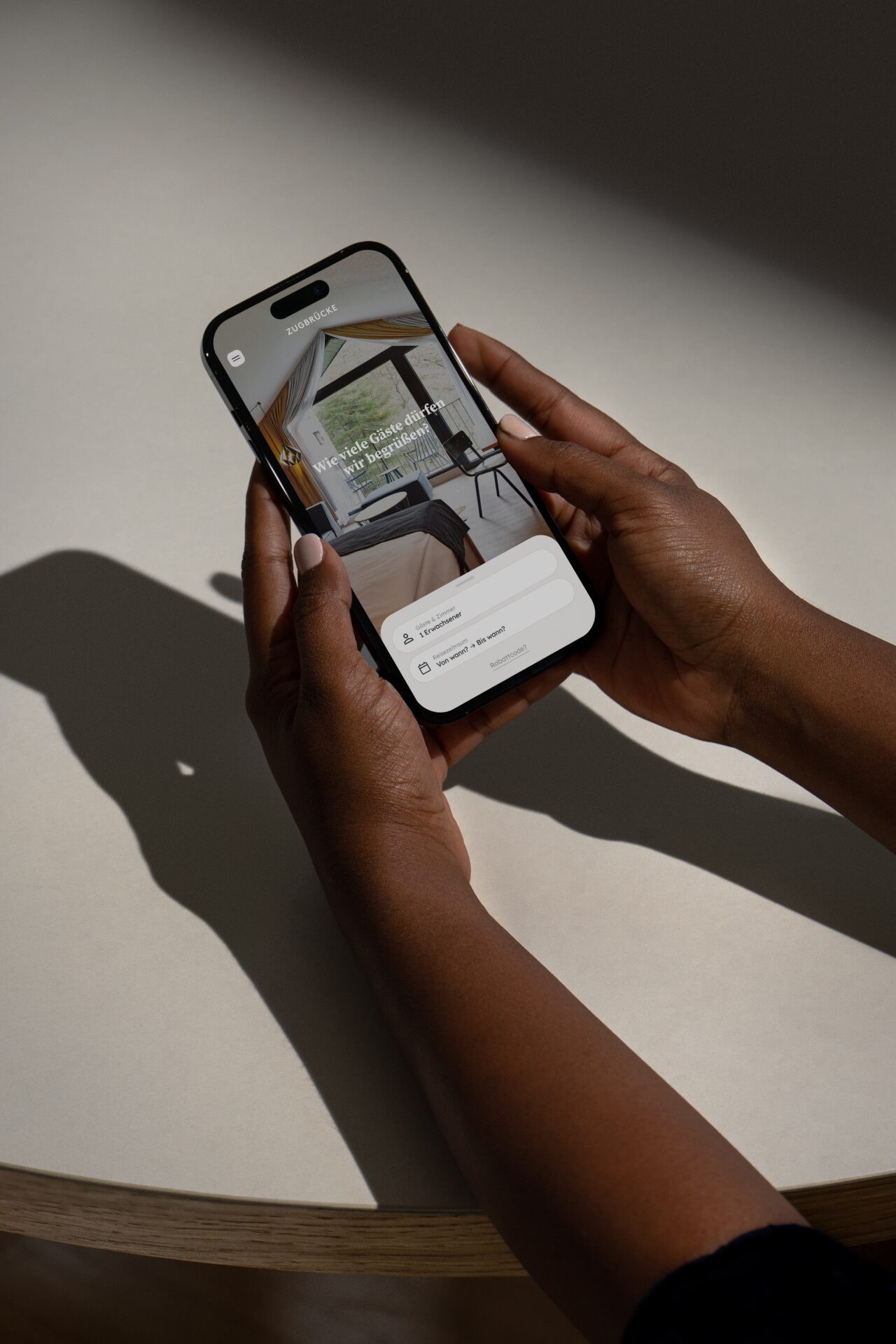
More than half of all bookings are now made on mobile devices. Expectation: same quality as on the desktop. OnePageBooking delivers – without compromise. Content can be shown and hidden flexibly. The mobile route remains intuitive and complete.
Our tip
Test yourself regularly – through the eyes of your guests. What seems too much? What is missing? It’s often small adjustments that make a big difference.
3. trust is created in detail
Before a guest books, they are looking for certainty: clear prices, understandable conditions, genuine reviews. OnePageBooking incorporates trust elements directly into the design – from visible cancellation conditions to the “secure” symbol when paying.
Our tip
Communicate openly. No footnotes, no question marks. Those who speak clearly come across as trustworthy – and sell better.
4. selection yes – excessive demands no
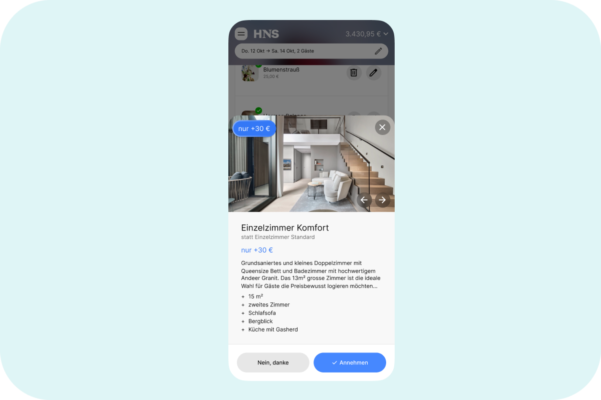
Too many options slow you down. Guests don’t want everything, they want the right thing. OnePageBooking only shows relevant additional services, calculates prices in real time and keeps the focus on the essentials.
Our tip
Check every extra for real added value. Can services be bundled? Can categories help? Clarity beats variety – and increases conversion.
5. FAQs are not filler material – they are conversion tools
Some bookings don’t fail because of the decision – but because of an unanswered question: Parking spaces? Airport transfer? Check-in times? With OnePageBooking you can place FAQs exactly where they are needed – in the middle of the booking process.
Our tip
Choose three to five key questions – and answer them visibly, clearly and directly. It’s often the details that decide who clicks.
Design decides – on aesthetics and success
Your booking screen is not a technical accessory. It is part of your brand. An expression of your attitude. And the moment when digital interest turns into a real stay.
OnePageBooking is your foundation. What you make of it is up to you – with an eye for detail, with clarity of design, with genuine hospitality.
Because where guests are not users, the booking process must not remain mere software. It becomes an invitation: personal, intuitive, stylish.
Would you like to know how to make your OnePageBooking even more successful?
Our support team and your personal customer service will be happy to assist you – with experience, sensitivity and an eye for what really counts.


